

Executive Summary
At the F3 event in Chattanooga, a series of new products and platform updates were showcased, all centered on making data more accessible, easier to use, and actionable for users. The updates spanned the entire Sonar platform, introducing new dashboards, powerful AI-driven insights, and key partnerships to create a more integrated user experience. Additionally, new standalone tools were spotlighted to bring critical data directly into users’ daily workflows.
The products and features demonstrated include:
- Major Sonar Platform Updates and New Partnerships
- Executive Insights Dashboard
- Maritime Trade Console
- Supply Chain Intelligence (SCI) with Genlogs Integration
- SONAR Quick Rates Chrome Extension
- Sonar Blue2Blue Mobile App
Sonar Platform Updates
A primary focus this year has been on improving the usability of the platform based on customer feedback. This effort has manifested in several key areas, including new partnerships, forecasting tools, and a suite of dashboards designed to provide insights from a high-level executive view down to a specific lane analysis.
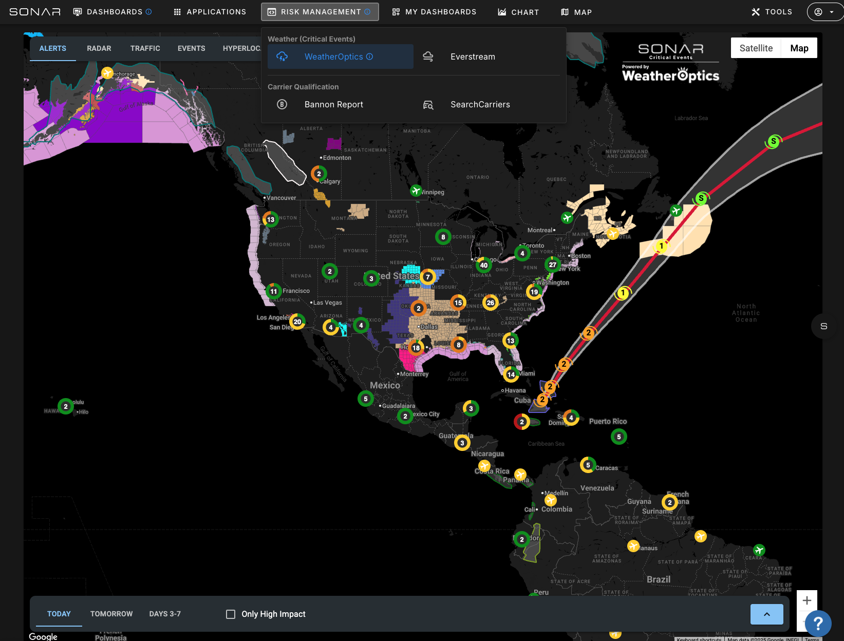
New Partnerships and Integrations The platform has been opened up to third-party developers, turning it into a portal that provides distribution for early-stage companies. New partnerships integrated directly into the Risk Management Portal include:
- Weather Intelligence: Integrations with Everstream and WeatherOptics provide real-time intelligence on major weather events and natural disasters. The WeatherOptics integration allows users to upload their own locations to see how they will be impacted, a feature that is free for users.
- Fraud Prevention: To address the major issue of fraud, two new partnerships were launched. Search Carriers provides detailed company information from government and private data sources, including VIN data to determine the average age of a carrier’s equipment. The Bannon Report integration allows users to validate any MC or DOT number, providing a simple green, yellow, or red score to quickly assess risk.
- Capacity Sourcing: An integration with Genlogs uses a national network of cameras to identify carriers that run specific lanes, helping users find additional capacity.
Forecasting and Data Visualization To help users answer the question “what’s going to happen next?”, a seasonally adjusted forecast has been released. This forecasting tool uses a seasonally adjusted moving average (SAMA), taking the previous two years of data and adjusting it to the current trend to project future market shifts. Initially shown for tender rejections, this tool can be used for any ticker in the platform, including forecasting rates at a lane level. It is now also easier to chart tender data alongside rates to clearly see the correlation and lead time.
New Dashboards A series of new dashboards were released to make data more digestible and reduce the need for users to memorize ticker symbols.
- Executive Insights Dashboard: Described as “Zach in a box,” this dashboard provides a high-level executive summary of the global supply chain and the U.S. freight market. It features simple bullish/bearish indicators for demand, rates, and capacity, an AI layer that analyzes and explains the data in plain text, and critical watch areas that flag issues needing immediate attention. It consolidates ocean, rail, and trucking data with macroeconomic indicators.
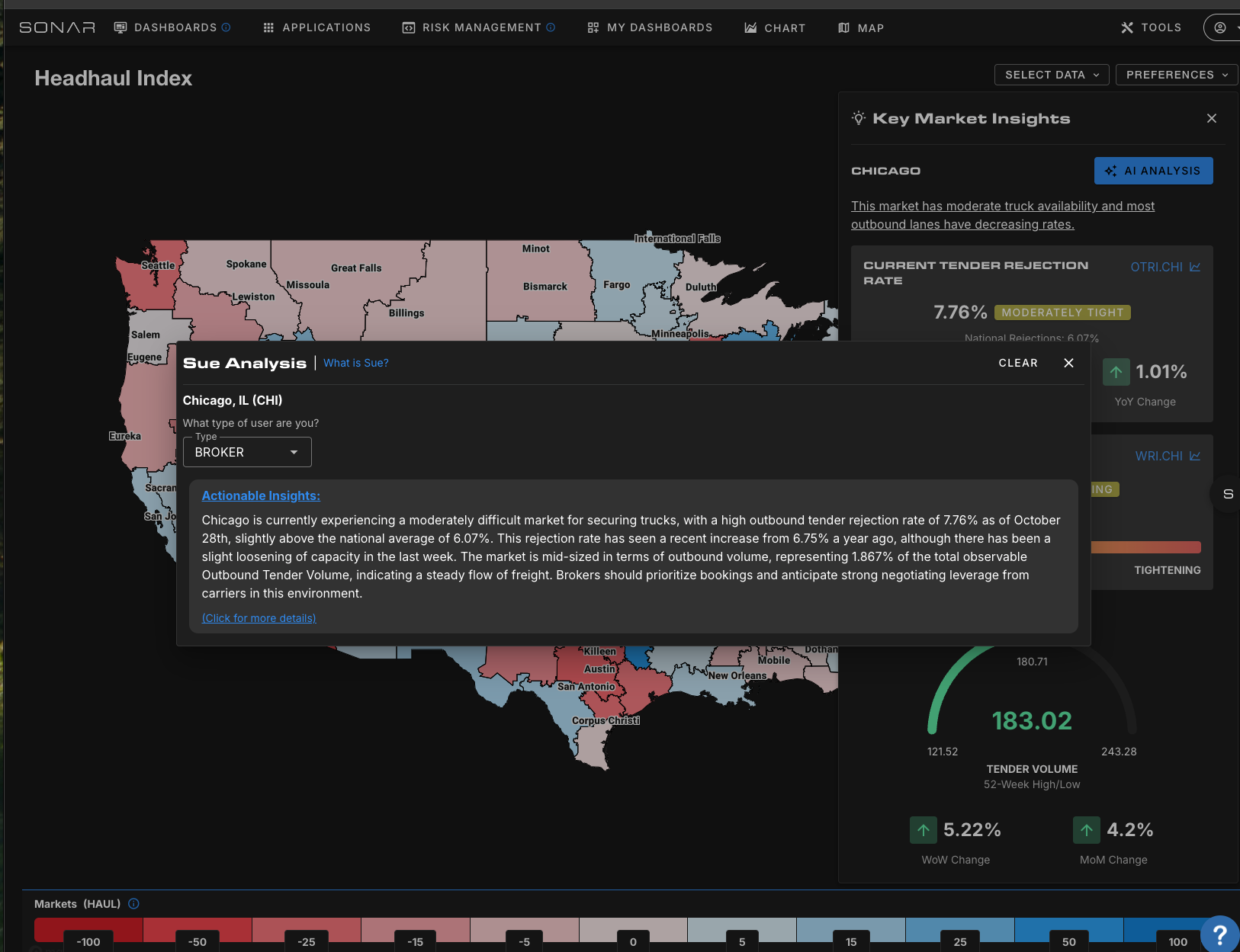
- Mode-Specific Dashboards: Users can drill down into mode-specific views like the Truckload National Insights page for a summary of the truckload market. From there, they can click into any market on the map to access the Key Market Insights page, which now features AI-driven analysis providing tailored guidance for carriers, brokers, and shippers. An Intermodal Dashboard helps users make strategic decisions by comparing truckload versus intermodal rates on a lane-by-lane basis to identify potential savings.
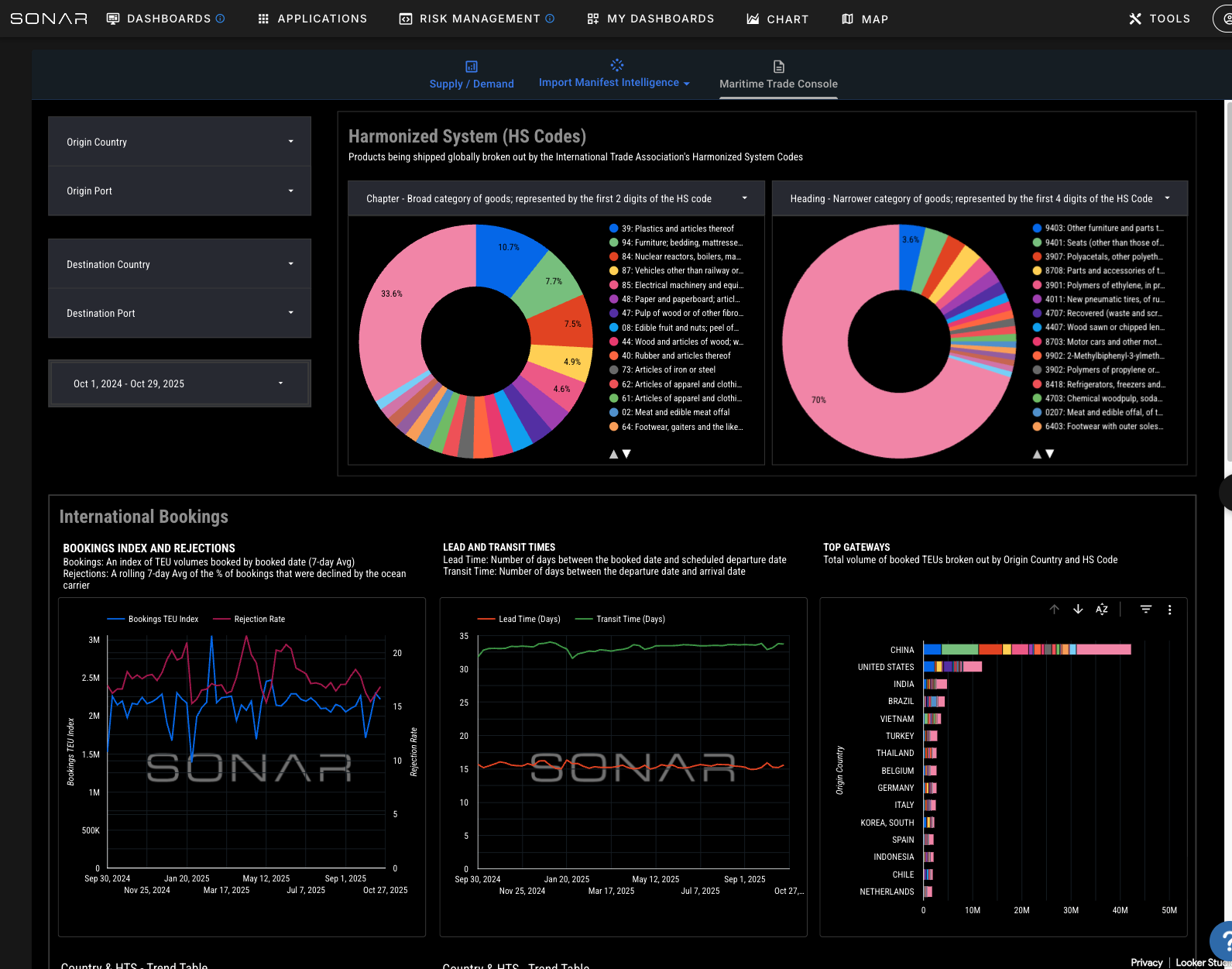
- Global Trade Dashboards: The Trade War Command Center offers a comprehensive overview of the upstream supply chain, connecting ocean volumes, intermodal, and truckload data with inventory levels and top news stories from FreightWaves. For an even more granular view, the new Maritime Trade Console details what is actually being shipped in containers. Using harmonized tariff codes, it provides insights into commodity flows based on both bookings data (from the moment an order is placed) and customs data (when it clears U.S. ports). Users can see who is shipping the freight, who owns it, and which carriers are moving it.
Supply Chain Intelligence (SCI) Platform, a benchmarking tool for shippers, has been revamped to be easier to use. It features a seamless integration with CASS for freight audit and bill pay customers, allowing them to access their data with the click of a button. The platform’s risk and efficiency quadrant helps users understand where they have leverage by analyzing rates against tender data. The most significant update is a new integration with Genlogs, which adds a “Find Capacity” button directly within SCI. If a user identifies an over-performing lane, they can instantly get a list of carriers that have recently run that lane, complete with contact information, out-of-service ratings, and power unit counts, making the data immediately actionable.
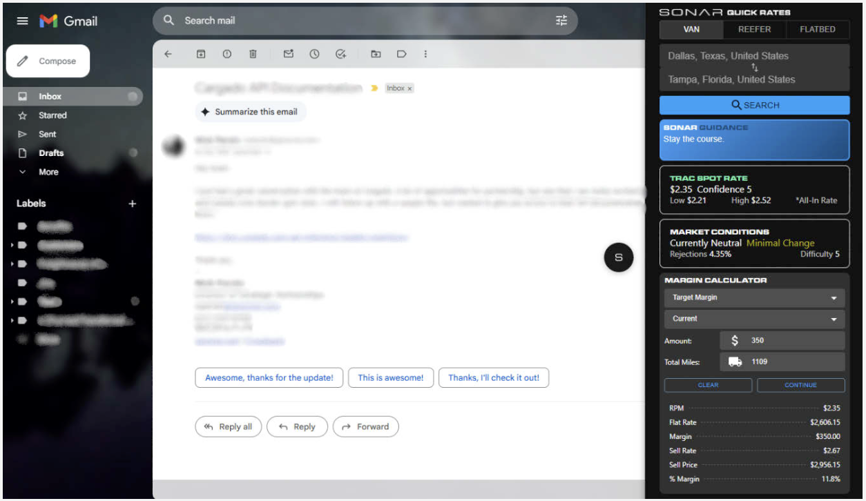
SONAR Quick Rates Chrome Extension
For users who need quick access to rates without leaving their current workflow, the Sonar Quick Rates Chrome extension is a lightweight solution. Available in the Chrome Web Store, the extension allows users in Gmail or a web-based TMS to type in a lane and instantly receive a spot rate, a low-to-high range, and simple market guidance (e.g., “negotiate,” “market is loosening”). Users can also input a target margin to calculate a sell price for both the shipper and the carrier. See additional visual here.
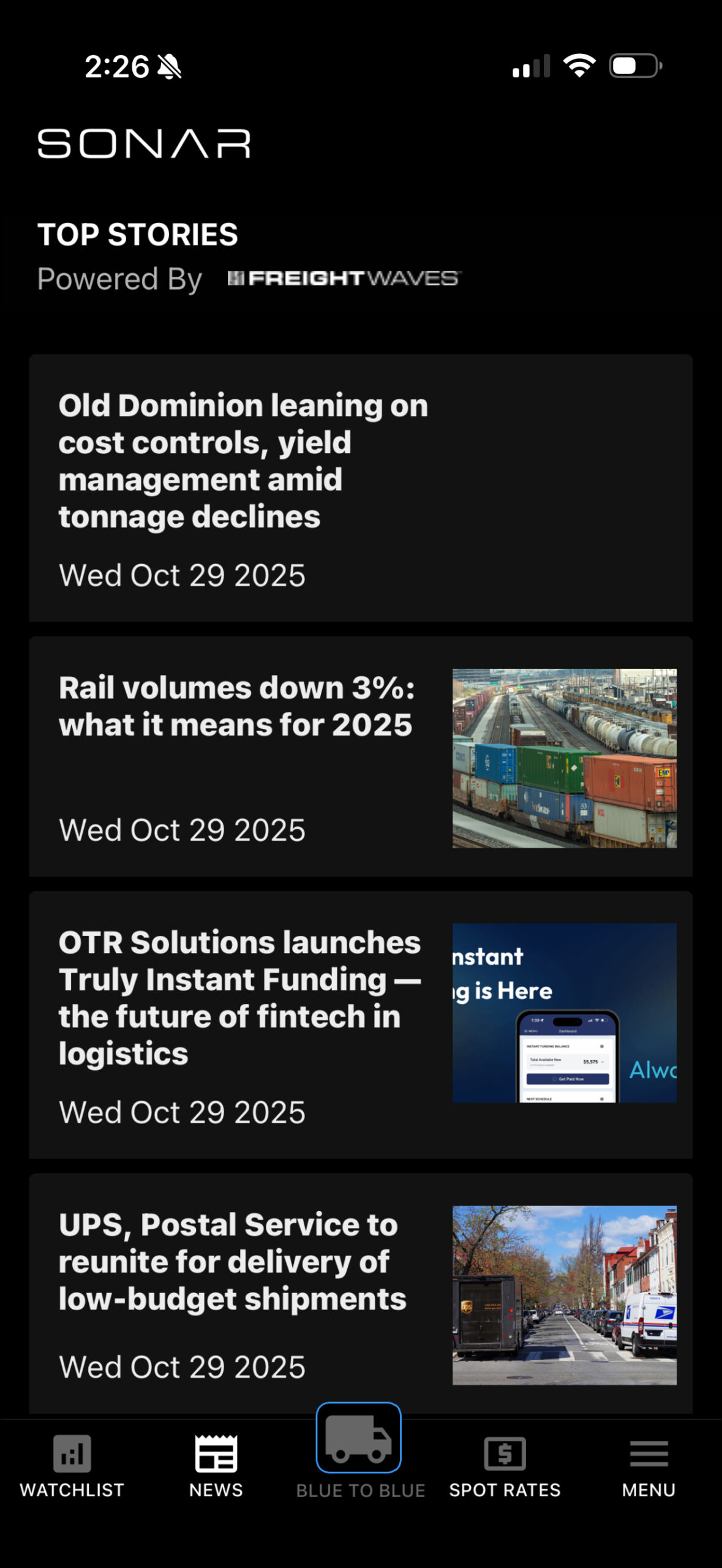
Sonar Blue2Blue Mobile App
The Sonar Blue2Blue iOS application is designed specifically for small asset carriers and owner-operators. The app is built around the “blue to blue” concept, which helps drivers plan their next load by moving from a strong outbound market (a “blue” market in the headhaul index) to another strong outbound market, maximizing utilization and minimizing empty miles. When opened, the app uses location services to identify the user’s current market. From there, a driver can see which destination markets are “blue” and will give them leverage for their next load. The app also provides market rates for lanes, news from FreightWaves, and the ability to create and monitor watchlists of Sonar tickers.
Interactive Map Functionality
Visualizations are key to understanding the freight market, and interactive maps have been integrated into several new and updated dashboards to provide at-a-glance insights. The Executive Insights dashboard features a map that can be toggled to show rates, volumes, and market changes. The Truckload National Insights dashboard includes a map that serves as a navigation tool; users can click on any market to drill down into the more granular Key Market Insights page for that area. In the SCI platform, the summary page map visualizes a shipper’s entire network, using colors to instantly identify which markets they are over- or underpaying in. The original headhaul index map, with its “blue” markets (more outbound freight than trucks) and “red” markets, was also highlighted as the core concept behind the new Blue2Blue mobile app.
Explore all of SONAR’s tools and features at gosonar.com and request a demo here.
To watch videos of these demos:


